
Range slider filter
Filtering on a number, by dragging rather than choosing from a list.
In short
The Range Slider filters on a numeric field. On the free version that field is price; with Pro it is any numeric custom field, on WooCommerce products and custom post types alike. Point it at the field, set the range it covers and how finely it moves, and visitors drag to narrow the results. It can be a single handle or two, laid out horizontally or vertically, and the values can carry a prefix or suffix so a number reads as money or a measurement.
What it filters on
Anything stored as a number, though which numbers you can reach depends on your version. The free version filters on price, which is the field most shops want a slider for. Pro opens the module up to any numeric custom field - weight, length, height, a year, a duration, a capacity, a distance - on WooCommerce products and on custom post types.
What matters is that the values are numbers, because dragging a handle only makes sense over something that has an order.
The same module over two kinds of content.
Choosing the field
Slide over any number, not just price
Price is the field the free version gives you, and on a straightforward shop that is often enough. With CAF Pro, Select Field opens to every numeric custom field you have - on WooCommerce products and on custom post types - so the same control works for a weight, a screen size, a year built, a running time, or a distance. Anything your content measures becomes something a visitor can drag a handle over.
Select Field is the first thing to set, and nothing else works until it is. The module needs to know which field it's reading before it can do anything with a range, so until you pick one the canvas shows an error in place of the slider rather than pretending to work.

Note
Seeing “Custom Field Key Is Not Set” on the canvas isn't a fault. It's the module telling you the first setting is still empty - choose a field and it goes.
Range Settings
| Setting | What it does | Default |
|---|---|---|
| Type | Single gives one handle and filters everything up to that point. Double gives two, for a range with a floor and a ceiling. | Double |
| Placement | Horizontal or Vertical. Vertical suits a narrow sidebar where a horizontal track would be cramped. | Horizontal |
| Min | The lowest value the slider reaches. | 0 |
| Max | The highest value it reaches. | 100 |
| Step | How far one movement of the handle travels. A step of 1 moves a unit at a time; a larger step moves in jumps. | 1 |
| Default Values | Whether the slider starts somewhere other than fully open. Switch it on and set the starting minimum and maximum. | Off |
Min and Max are the boundaries of the control, not of your data. Set them to cover the values you actually have - a price slider running to 100 on a shop whose products reach 400 leaves most of the catalogue unreachable, and one running to 10,000 on a shop topping out at 80 gives visitors a huge stretch of empty track to drag through.
Step is worth matching to the field. Whole units suit prices and years; a fractional step suits weights or measurements where the difference between two neighbouring values matters.
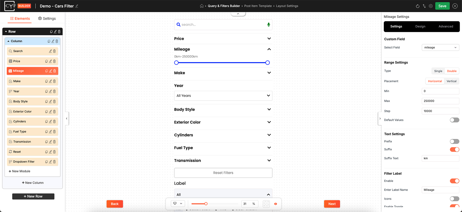
The shape of the control, and the range it covers.

Tip
Leave Default Values off unless you have a reason. A slider that starts fully open shows the visitor everything and lets them narrow from there; one that starts part-closed is quietly hiding results before they've asked for anything.
Text Settings
The slider shows its current values above the track, and on their own those are bare numbers. Prefix puts something in front of each one and Suffix puts something after, each with its own switch and its own text - a currency symbol in front, or a unit behind.
Use one or the other, not both out of habit. A number with something on each end reads as a formula rather than a value.
Filter Label
The label above the module. Enable turns it on, Enter Label Name is the wording, and Icons adds an icon beside it. The label is doing more work here than on most filters - a slider showing 0 to 100 tells a visitor nothing about what's being measured, so the label is the only thing naming it.
Styling
The Design tab has two tabs: Container for the block holding the label and the control, and Slider for the control itself. Both carry the usual groups - Text, Sizing, Spacing, Background, Border and Box Shadow.
Under Slider, Sizing splits into two targets, because a slider is two things that need different treatment.
| Target | What it sizes |
|---|---|
| Track | The bar itself - its width across the module, and its thickness. |
| Thumbs | The handles a visitor drags. |
Thumbs are worth a moment. They're the only part of this module anyone touches, and a handle sized for a mouse pointer is hard to catch with a thumb on a phone - err on the generous side.
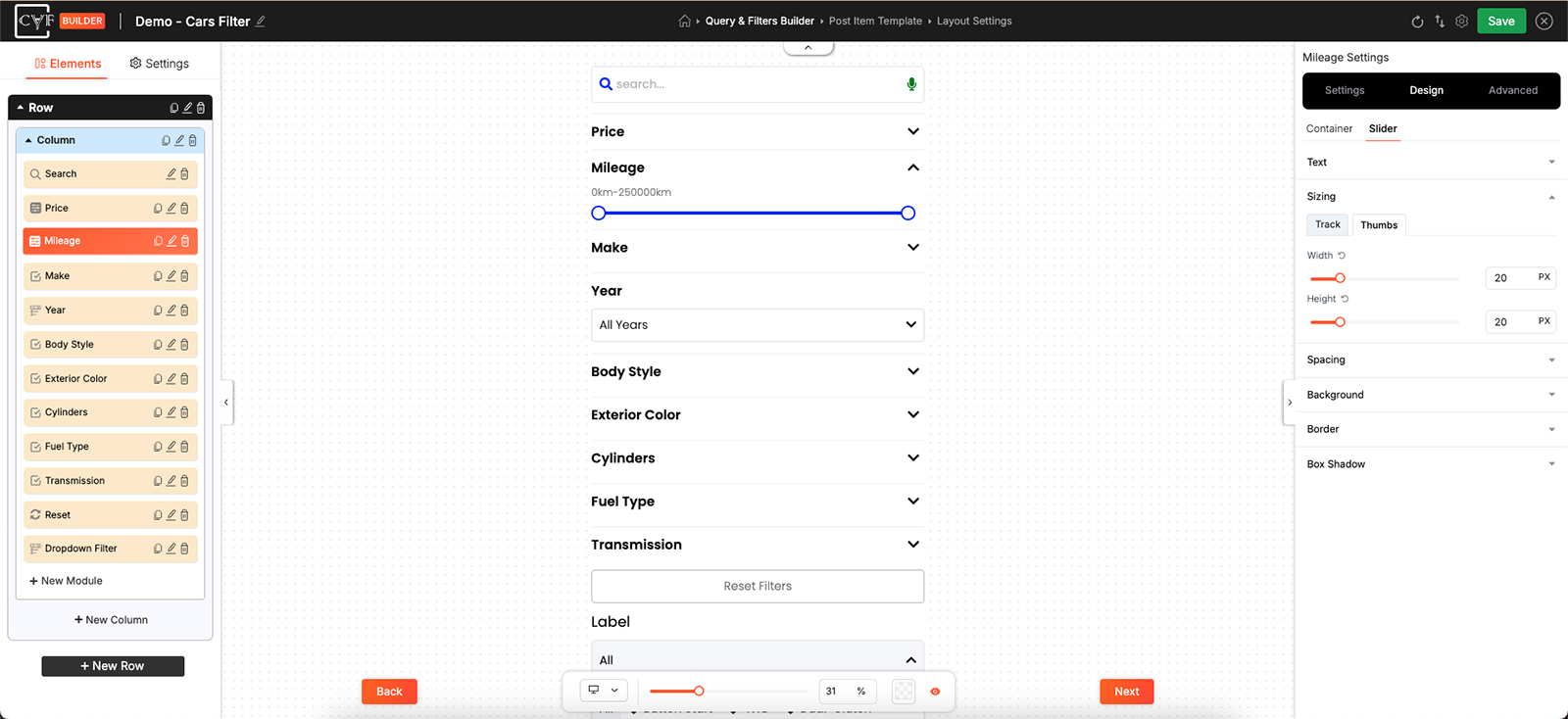
The bar and the handles, sized separately.
FAQ
The canvas says the custom field key isn't set.
No field has been chosen yet. Pick one under Select Field and the slider appears.
Can I use it for something other than price?
Yes - any numeric field. Weight, length, height, a numeric attribute, or a custom field of your own.
Does it work on a site without WooCommerce?
Yes. Posts and custom post types work the same way, as long as the field holds numbers.
What's the difference between Single and Double?
Single gives one handle, filtering everything up to that value. Double gives two, for a range with both ends set.
Can the slider run vertically?
Yes - set Placement to Vertical.
How do I add a currency symbol?
Switch on Prefix and set the text.
Visitors are struggling to grab the handles on mobile.
Increase the Thumbs size under Sizing on the Slider tab.
Can the slider start part-closed?
Yes - switch on Default Values and set the starting minimum and maximum.
Was this page helpful?
Thanks for your feedback!