
Dropdown filter
A list of choices folded into a single control that opens when clicked.
In short
The Dropdown Filter offers your terms or custom field values as a list that opens from one control. A visitor picks one option at a time, and a placeholder shows before anything is chosen. Each option can carry an icon or colour swatch and a result count, a long list can be cut short, and styling splits three ways: the container, the closed control, and the list that opens. Four things here need Pro: the Custom Field source, the WooCommerce Product Filters, Show More, and the label’s icon and collapse.
When to reach for it
A dropdown takes one line of space no matter how many options it holds, which is what makes it worth having. It shows nothing until it's asked, so a filter offering several taxonomies can stay a few lines tall instead of running down the page.
The trade is visibility: a visitor has to open it to find out what's inside. Use it where the options are predictable - sizes, years, a handful of categories - and something more open where browsing the options is part of the point.
One line closed, the full list when opened.
Data Source
First, what the list is made of. Data Source has two tabs, Taxonomy and Custom Field, and the Taxonomy tab groups what it offers into three sets.
| Source | What it lists | Plan |
|---|---|---|
| Taxonomies | Categories, tags and any custom taxonomy on your site. | ✓ FREE |
| Attributes | WooCommerce product attributes such as colour or size. | ✓ FREE |
| Product Filters | WooCommerce stock status, on sale and rating. | ★ PRO |
| Custom Field | The values held in a custom field. | ★ PRO |
Product Filters:
the things a shopper actually asks for Categories and attributes describe what a product is. With CAF Pro, the Product Filters set adds what shoppers ask about instead - in stock, on sale, and rating. These are not taxonomies, so there is no way to build them from the free source list; Pro reads them from WooCommerce directly.
Pick a source and its terms are listed with a checkbox each, so you can offer all of them or only some. Two small controls sit beside every term: one sets that term's own colour or icon, and the other marks it as the default - the option the filter starts on when the page loads.
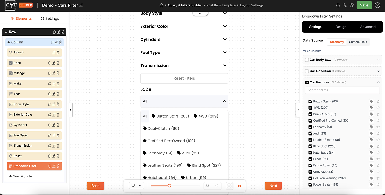
Choose the terms to offer, and set colours, icons or a default.

Note
Attributes and Product Filters read WooCommerce data, so they only appear on a site running WooCommerce. Taxonomies and custom fields work with posts and custom post types too.
Using a custom field instead
Filter by custom fields, not just taxonomies
Plenty of what people want to filter by was never filed as a category - a bedroom count, a year, a material, a field your theme or ACF added. With CAF Pro, the Custom Field source builds the dropdown from those values instead, so you can offer the choice without first restructuring your content into taxonomies.
A taxonomy already knows its own terms, so the list builds itself. A custom field doesn't - the values live on individual posts, and CAF has no way of guessing which of them you want offered. So with Custom Field selected you build the list yourself, in three steps.
- Choose the field, by its meta key.
- Choose the comparison - how a visitor's choice is matched against the stored value
- Add the values, one at a time, and each becomes an option in the dropdown.
Advanced Options holds a Meta Type for the field, worth setting when the values are numbers rather than text so they're compared as numbers. Add Field adds a second field to the same module if one isn't enough. Everything after that works the same as a taxonomy: each value can carry its own colour or icon, and can be set as the default.
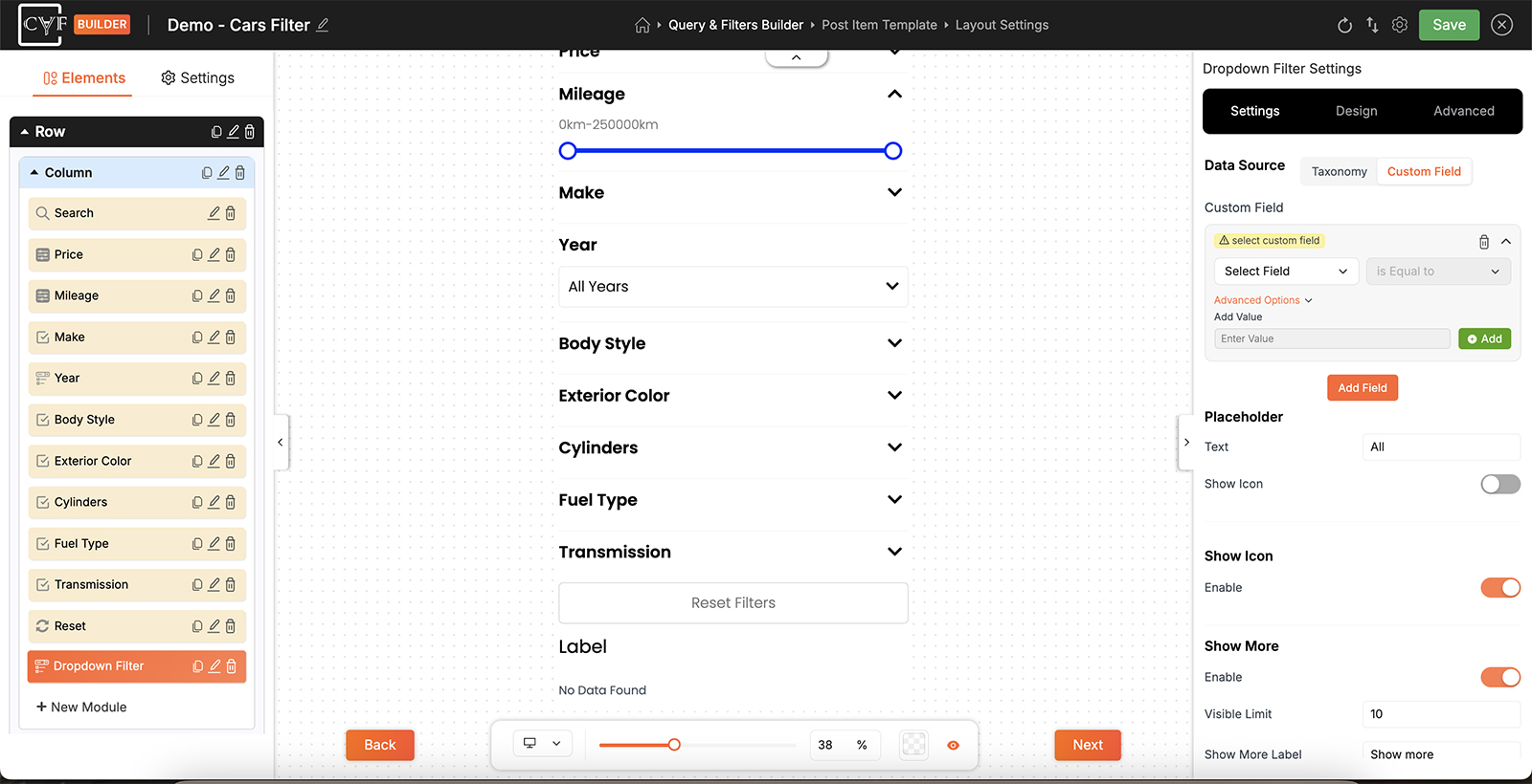
The values you add become the options in the dropdown.
Icons and images per option
An icon can come from the built-in library, or you can upload your own as an SVG or PNG. The choice is made per term, so a few options can carry library icons while others use artwork of your own, in the same dropdown.
Uploaded images are used at the size you supply them, so prepare them before uploading: consistent dimensions across the set, and no larger than they need to be. A mix of sizes shows up immediately as options that don't line up.
Placeholder
The control needs something to show before a visitor has chosen anything, and that's the placeholder. Placeholder Text is the wording, and Show Icon adds an icon beside it.
It does a second job too: the placeholder appears at the top of the open list as the option that clears the filter, so it's how a visitor gets back to seeing everything. Write it as a state rather than a label - the filter label above already names what the dropdown is for, and this only has to say that nothing is applied yet.
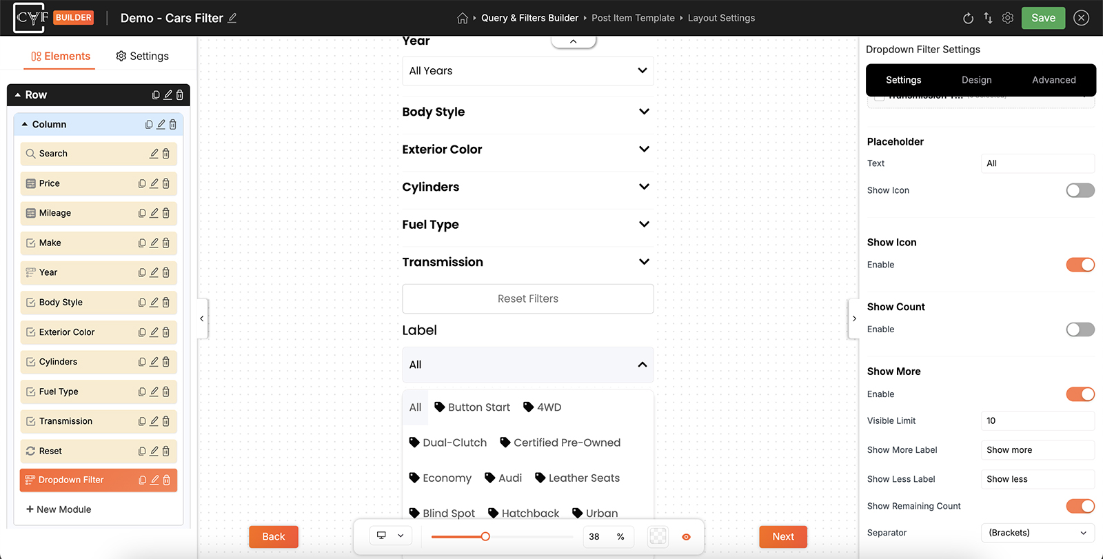
The wording shown before a choice, and in the list as the way back to it.
The parts of an option
Each option in the list is built from up to three parts, and each has its own switch.
| Part | Setting | What it adds |
|---|---|---|
| Icon/Image or Colour Swatch | Show Icon / Color Swatch | The colour, icon or uploaded image you set against each term or value. |
| Text | Always shown | The term name, or the custom field value. |
| Count | Show Count | How many results carry that term. |
Whichever you choose under Display As - a Colour Swatch or an Icon/Image, one or the other and never both - sits in front of the text, so the visitor sees it first and the name after it.
Show More
A taxonomy with forty terms makes for a lot of scrolling inside a dropdown. Show More cuts the list to a set length and adds a link to open the rest.
Show More: long lists that stay usable
Without it the open list runs to every term you offer, which turns a large taxonomy into a scroll inside a scroll. With CAF Pro, Show More caps it at a length you set and puts the rest behind a link - with your own wording for opening and closing it, and a count of how many are still hidden.
| Setting | What it does |
|---|---|
| Visible Limit | How many options show before the list is cut. |
| Show More Label | The wording on the link that opens the rest. |
| Show Less Label | The wording on the link that closes it again. |
| Show Remaining Count | Adds how many are still hidden, so the link says how much more there is. |
| Separator | How that number is set apart - brackets, a hyphen, nothing, or a custom character. |
A label that collapses, and carries an icon
With CAF Pro the label gets two more options: Show Icon puts an icon beside the wording, and Enable Collapse lets visitors fold the module away by clicking it. Collapse is the one that earns its keep on a sidebar carrying several filters - a visitor can close what they have finished with instead of scrolling past it.
Arranging the parts
Where those parts sit relative to each other is set on the Design tab, and it's arranged in two places rather than one - because the parts appear twice. The closed control shows the chosen option; the open list shows all of them. Each is arranged on its own.
| Where | Pairing | What it arranges |
|---|---|---|
| Select Field | Icon + Text | The icon or swatch against the text of the chosen option. |
| Options | Items Container | The options as a set - running down the list, or across it. |
| Options | Icon + Text | The icon or swatch against each option's text. |
| Options | Text + Count | The option's text against its count. |
Every one of them gets the same controls: Direction for the order they run in and which comes first, Align X and Y for how they line up, and Gap for the space between. The alignment values are the ones used throughout the builder - top, centre and bottom; left, centre and right; space between, space around and space evenly. They behave as described on Flex layout settings.
Only the pairings that apply are offered. Switch the count off and Text + Count goes with it; switch the icon off and Icon + Text goes too.
Select Field offers Icon + Text but no count, which is deliberate: the closed control shows the one thing chosen, and a result count beside it would say nothing useful. Inside the open list, where counts help someone choose, Text + Count is there.
The list as a set, and the parts within each option.

Careful
Where a tab offers more than one pairing, change one at a time and leave the others at their default values - the reset icon beside each control puts a setting back. They arrange parts of the same option, so unusual directions on several at once produce results that fight each other.
Styling each part
The Design tab has three tabs, and the split follows what a visitor sees at each moment.
| Tab | What it styles | Layout targets |
|---|---|---|
| Container | The block holding the label and the control. | Outer Wrapper, Label |
| Select Field | The closed control, showing the current choice. | Icon + Text |
| Options | The list that opens. | Items Container, Icon + Text, Text + Count |
Each target carries the usual groups - Text, Sizing, Spacing, Background, Border and Box Shadow - so the open list can look nothing like the control that opens it.
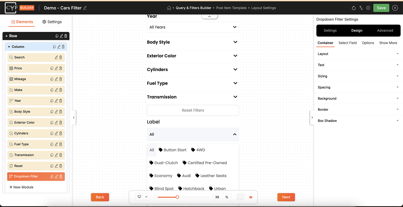
The closed control and the open list, styled separately.

Tip
Style the closed control first. It's the part visitors see every time the page loads, and the one that has to sit properly alongside your other filters - the open list is only ever on screen for a moment.
FAQ
Can visitors pick more than one option?
No. The dropdown is a single choice - picking another replaces the first.
How does a visitor clear their choice?
By choosing the placeholder option, which sits at the top of the list.
Can I change the wording shown before a choice is made?
Yes - Placeholder Text.
How do I have an option already chosen when the page loads?
Mark it as the default in the source list.
Can options have icons or colours?
Yes - set a colour or an icon against each term or value in the source list, then switch on Show Icon / Color Swatch.
Can an option have both a colour and an icon?
No - it's one or the other.
Can I use my own artwork instead of the icon library?
Yes - upload an SVG or PNG, per term.
Why is there no count option on Select Field?
The closed control shows the single choice that's applied. Counts appear in the open list, where they help someone choose.
Why doesn't the custom field list its values automatically?
Values live on individual posts rather than in a list of their own, so you add the ones you want offered - field, comparison, then the values.
My list is very long.
Switch on Show More and set a visible limit. Show More is a Pro feature.
Was this page helpful?
Thanks for your feedback!