
Text settings
Text sets the typography of whatever you've selected - and where an element holds more than one piece of text, each can be styled on its own.
In short
The Text group covers font family, weight, style, colour, size, letter spacing, line height and alignment. Where an element has more than one piece of text it gains an inner tab for each, so a prefix can look different from the title beside it - and which tabs appear depends on that module's settings. Most also offer Default and Hover states, and every value is set per device.
The controls
Text appears in the Design tab of any element that contains text. Rows and columns don't have it, since they hold other elements rather than words of their own.
| Control | What it does |
|---|---|
| Font Family | The typeface. |
| Font Weight | How heavy the text is, from light through to bold. |
| Font Style | Toggle buttons for styles such as italic, underline and strikethrough. |
| Color | The text colour. |
| Font Size | Size of the text, as a value with a unit. |
| Letter Spacing | Space between individual characters. |
| Line Height | Space between lines of wrapped text. |
| Text Align | Left, centre, right or justified. |
Styling each piece of text separately
Where an element holds more than one piece of text, the Text group gains inner tabs so each can be styled independently - a title's prefix can carry a different size, weight or colour from the title beside it.
Which tabs you see isn't fixed. They follow whatever text that element currently has, which comes from its own Settings tab: switch something like a prefix or a suffix on and a tab for it appears. The same module can therefore show one tab in one filter and several in another, so check the tabs in front of you rather than assuming a set.
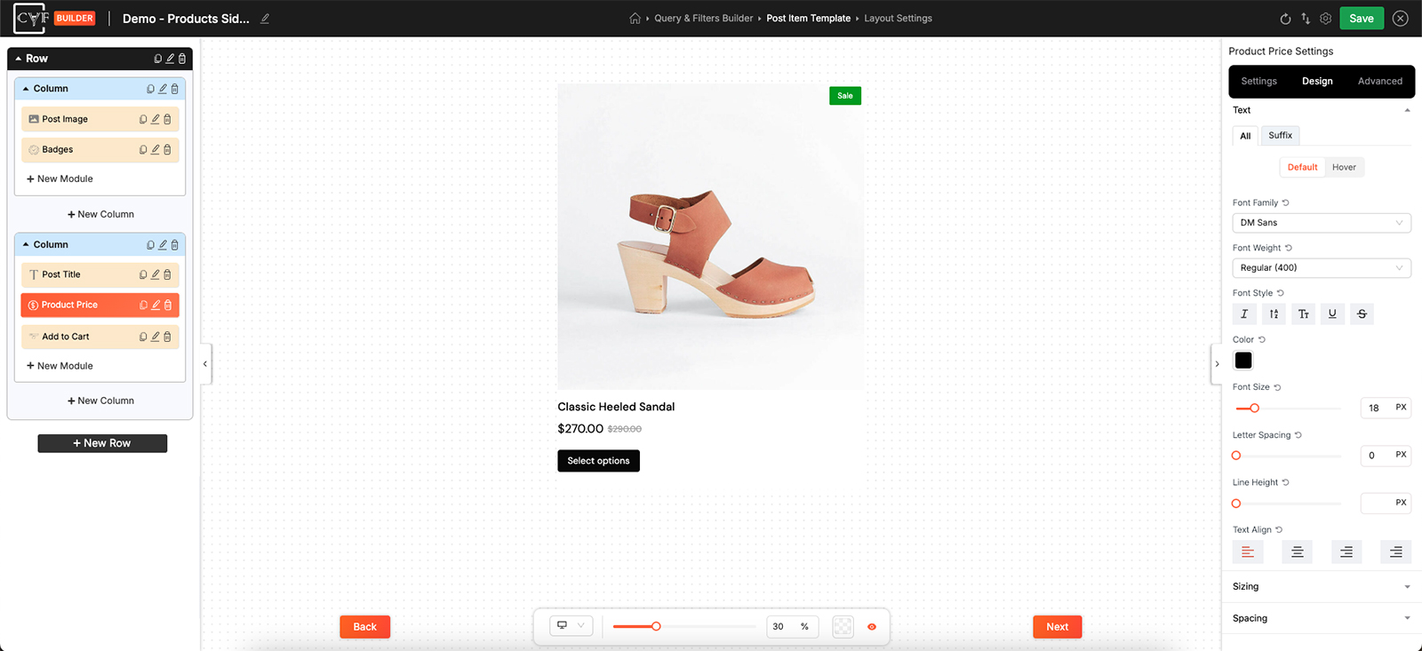
The tabs follow whatever text the element currently has.
Default and Hover
Above the controls sit Default and Hover. Set the normal appearance on Default, then switch to Hover and change only what should differ when someone points at the text - a colour change on a linked title, for instance. Anything you leave alone on Hover simply stays as it is.

Note
Text values are per device like the rest of the Design tab. Switch device in the bottom bar before changing a size, so a smaller heading on mobile doesn't shrink your desktop layout too.

Tip
Line height is what usually fixes cramped or airy-looking results - more often than font size, which changes the layout around it as well.
FAQ
Can I style a title's prefix differently from the title?
Yes - once a prefix is switched on it gets its own tab in the Text group, separate from the title.
Why does my Text group have tabs inside it?
That element holds more than one piece of text, and each gets its own tab.
Why does the same module show different tabs in another filter?
The tabs follow the module's own settings, so switching a piece of text on or off changes which tabs appear.
Can text change appearance on hover?
Yes - switch to Hover above the controls and set only what should change.
Why is there no Text group on my row?
Rows and columns hold other elements rather than text of their own.
Can I use a smaller font size on mobile?
Yes - switch device in the bottom bar first, then set the size.
Was this page helpful?
Thanks for your feedback!