
Sizing settings
Sizing sets how big the element itself is - as opposed to Layout, which arranges what sits inside it.
In short
Two controls: Width and Height. Both start at auto, which lets the element size itself to its content, and both take a value with a unit when you want to fix them. This is where a column's width is set.
Width and height
Sizing sits in the Design tab of any element, and on a module it belongs to the part you're on - so you can size a whole filter module or just one item inside it.
| Control | What it does |
|---|---|
| Width | How wide the element is. Left on auto, it takes its width from its content and its surroundings. |
| Height | How tall the element is. Left on auto, it grows to fit whatever is inside. |
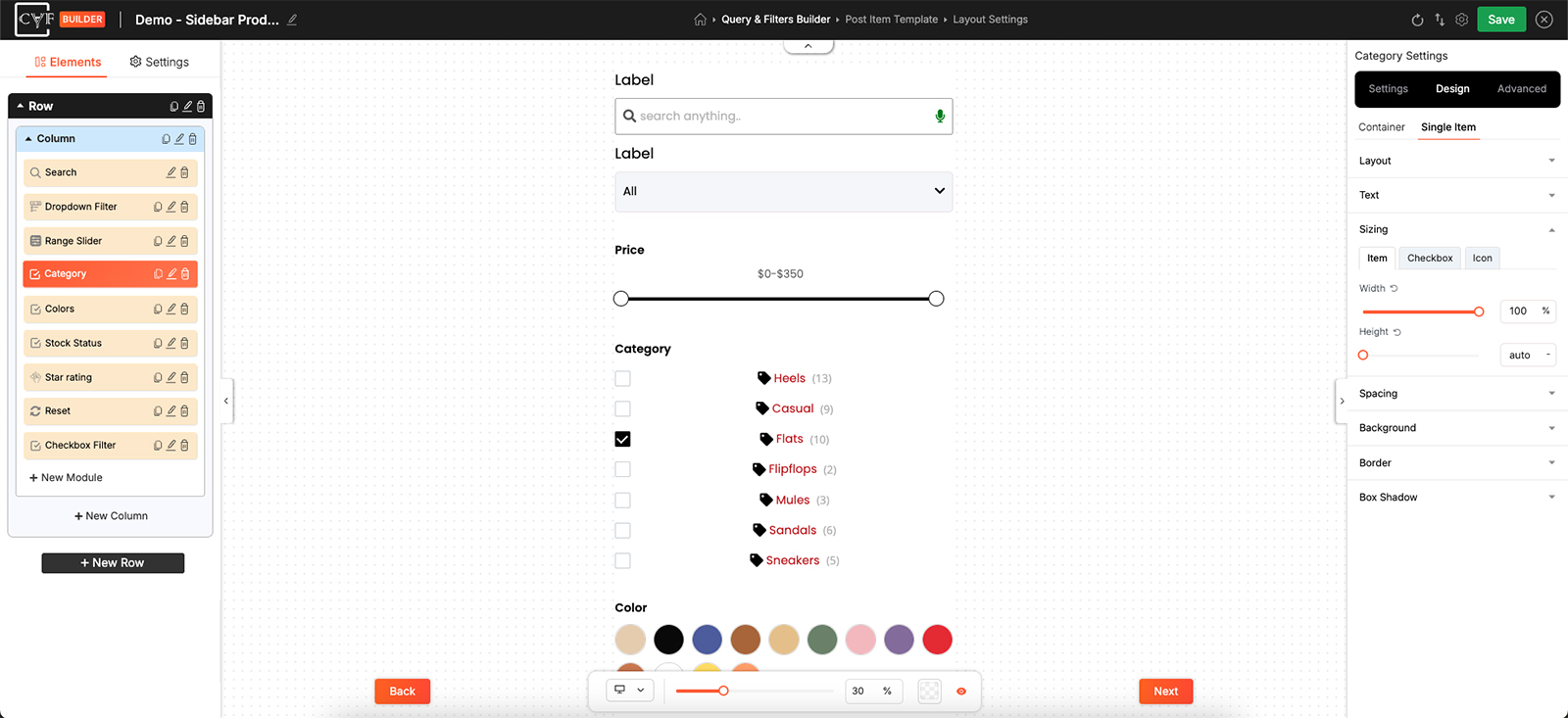
Two controls, both starting at auto.

Note
Auto is the default and usually the right answer. Set a value only where you actually need one - a column that has to hold a fixed proportion, for instance. Column width is set here rather than in Layout, which arranges the contents instead.

Warning
Be careful fixing a Height on anything whose content varies. A term list grows and shrinks with the taxonomy behind it, so a height that fits today can cut items off once the list gets longer. Leaving Height on auto avoids that entirely.

Tip
A width in percent adapts as the space around it changes; one in pixels stays put. If you do fix a width, check it on Tablet and Mobile in the bottom bar - Sizing is per device, so you can give each its own value.
FAQ
How do I change a column's width?
Open the column's settings, go to the Design tab, and set Width under Sizing.
What does auto mean?
The element sizes itself to its content rather than to a value you've set.
Why is some of my content cut off?
Check whether a fixed Height is set. Switching it back to auto lets the element grow to fit.
Can an element be a different width on mobile?
Yes - switch device in the bottom bar first, then set the width.
Was this page helpful?
Thanks for your feedback!