
What is the bottom bar?
The bottom bar floats over the canvas on every step, and controls how you view your work - including which device you're designing for.
In short
The bottom bar carries four controls: the device switcher, zoom, a checkered background toggle, and an eye icon that hides both side panels. The device switcher is the important one - it doesn't just preview your layout at Tablet or Mobile, it lets you set styling that applies only at that size.
The controls
The bar sits at the bottom of the canvas and stays with you across all three steps - it isn't a step of its own.
| Control | What it does |
|---|---|
| Device switcher | Switches between Desktop, Tablet and Mobile. |
| Zoom | Scales the canvas view, shown as a percentage. |
| Checkered background | Toggles the checkered backdrop behind the canvas. |
| Eye icon | Hides both side panels for an unobstructed view. |
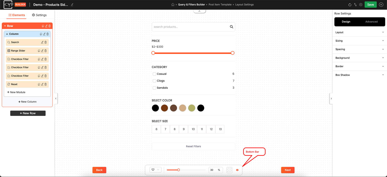
The bottom bar stays available on every step.
Responsive design
The device switcher does more than preview. Switch to Tablet or Mobile and the values you then set in the Design tab apply only at that size, so you can give a filter a different layout on phones without touching how it looks on desktop.

Tip
Build on Desktop first, then switch to Tablet and Mobile to adjust what needs changing at those sizes.

Note
Not everything is set per device. If a Settings tab or an option disappears when you switch to Tablet or Mobile, that setting applies to every device. Switch back to Desktop to change it.
FAQ
Does switching device change my design or just preview it?
Both - it previews at that width, and any Design values you set while switched apply only to that device.
Which devices can I design for?
Desktop, Tablet and Mobile.
How do I get more room on the canvas?
Use the eye icon to hide both side panels, and zoom out if you need to see more.
Is the bottom bar part of a particular step?
No - it stays available on all three steps.
Was this page helpful?
Thanks for your feedback!