
Flex layout settings
Layout arranges whatever sits inside an element. It's a full flex system rather than a set of fixed layouts, so you decide how things line up instead of choosing from presets.
In short
Set Display to Flex and the Layout group gives you Direction, Align X and Y, Gap, Wrap and Float. It's available on every row, column and module, and every value can differ by device - so arrangements that would normally need custom CSS are set by hand here.
Why it works this way
Most filter plugins give you a handful of fixed arrangements - a sidebar, a top bar - and you pick the nearest one. CAF gives you the underlying flex controls instead, on every element, so the arrangement is yours to decide rather than one you settle for.
In practice that means layouts you would otherwise have to write CSS for are set from this panel, and each one can be arranged differently on Desktop, Tablet and Mobile.
The controls
Open any element's Design tab and expand Layout. Display comes first, because it decides the rest: choose Flex and the arrangement controls become available. Each control has a small reset arrow beside it that returns just that setting to its default.
| Control | What it does |
|---|---|
| Display | Block or Flex. Flex turns on the arrangement controls below it. |
| Direction | Which way the items inside run - four arrows for right, down, left and up. |
| Align X | How items line up horizontally. |
| Align Y | How items line up vertically. |
| Gap | The space between items, set as a value with a unit. |
| Wrap | On, items flow onto a new line when they run out of room. Off, they stay on one line and scroll. |
| Float | None, Left or Right. |
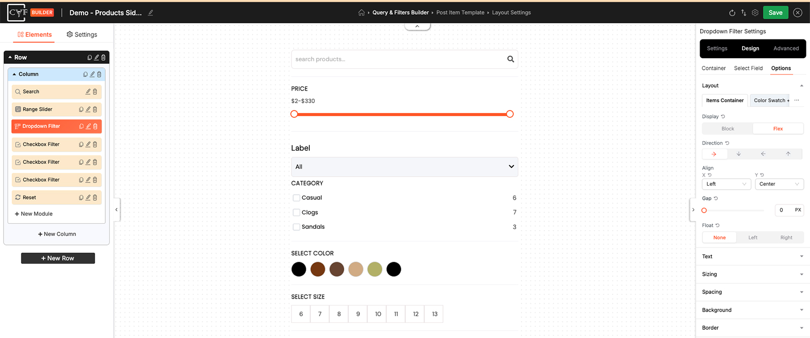
Display first; the rest follow from it.

Note
On a module, Layout appears under each part rather than once for the whole thing - a Checkbox Filter has one for Items Container, one for the label, and so on. Not every part offers every control: Wrap belongs to the part that holds a set of items, so you'll find it on Items Container rather than on a single item. See Design tab for how those parts are laid out.
Note
Layout arranges what's inside an element. To change the size of the element itself, use Sizing - a column that's too narrow is a Sizing problem, not a Layout one.

Tip
Turn Wrap off to keep filter items on a single scrolling line instead of letting them stack into a taller block. It's a good fit for a long list of terms in a narrow column, where wrapping would push everything else down the page.
Tip
Changed something and want it back? The reset arrow beside a control returns that one setting to its default, without disturbing anything else you've set. Remember values are per device - switch device in the bottom bar before adjusting a phone layout.
FAQ
Which elements have Layout?
All of them - rows, columns and modules.
Do I need to know CSS flexbox to use it?
No - the controls are set from the panel, and they cover the arrangements you'd otherwise write CSS for.
Can I arrange things differently on mobile?
Yes - switch device in the bottom bar first, then set Layout. Every value is per device.
How do I keep all my filter items on one line?
Turn Wrap off. The items stay on a single line and scroll instead of flowing onto more lines.
Why can't I find Wrap?
It sits on the part that holds a set of items - Items Container on a Checkbox Filter - not on a single item.
Why are the arrangement controls doing nothing?
Check Display - the Direction, Align and Gap controls apply when it's set to Flex.
How do I undo one setting?
Use the small reset arrow beside that control.
Was this page helpful?
Thanks for your feedback!