
Background settings
Background fills the space behind an element. What you can set varies - a row offers image options that a single filter item has no use for.
In short
Background sits in the Design tab, but its options change with what you've selected. A row or column offers Color, Image and Post Image; a part of a filter module often offers a background colour alone - and a colour can be flat or, with Pro, a gradient. States go beyond Default and Hover here, and filter items add Selected for when a visitor has chosen that term.
What you can set depends on the element
Background doesn't offer the same options everywhere. Rows and columns hold other content, so they get the full set of background types. A part of a filter module usually needs nothing more than a colour, and shows just that. On a module, remember the options also belong to the part you're on - see Design tab. Read what's in front of you rather than expecting a fixed set.
Background types
Where an element offers a choice of types, they appear as tabs across the top of the group.
| Type | What you get |
|---|---|
| Color | A colour fill behind the element - flat or a gradient, chosen in the picker. |
| Image | An image you choose yourself, with the controls below. |
| Post Image | The post's own image, so every result in the listing shows its own rather than one fixed picture. |

Tip
Post Image is the one worth knowing about. Because it pulls each post's own image, a single background setting on the row gives every result in your listing a different backdrop - no per-post work at all.
Choosing a colour
Opening a colour brings up a picker with two tabs of its own: Single gives a flat colour, and Gradient (Pro) blends between colours. So a gradient isn't a separate background type. It's a way of setting the colour. So a gradient isn't a separate background type - it's a way of setting the colour. The picker also takes a HEX value directly and has an opacity setting, which is how you get a partly transparent background.
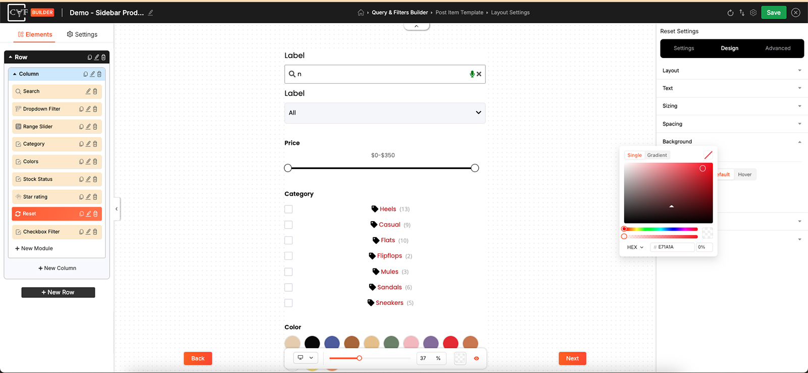
A colour can be flat or a gradient.
Image options
Choosing an image adds controls for how it behaves inside the element.
| Control | What it does |
|---|---|
| Background Image | The image itself. |
| Background Image Size | How it fits - Cover fills the element, other options fit it inside. |
| Background Image Position | Where it sits, such as Top Left. |
| Background Image Repeat | Whether it tiles to fill the space or appears once. |
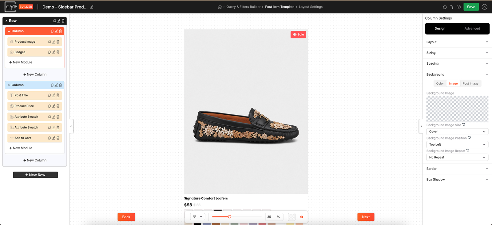
Background types appear as tabs where the element offers a choice.
Default, Hover and Selected
Most groups offer Default and Hover, as described for Text. Checkbox and Dropdown filters add a third: Selected, which styles the item a visitor has currently chosen.
That third state is worth using. Giving a selected term its own background colour is the clearest way to show which filters are active, without visitors having to scan the whole panel to work it out.
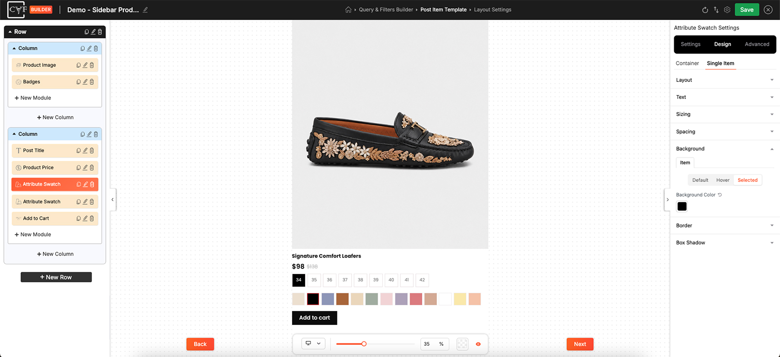
Filter items carry a third state for when a term is chosen.

Note
Background values are per device. Switch device in the bottom bar before changing one, so a mobile-only background doesn't overwrite the desktop design.
FAQ
Why does my element only offer a background colour?
Because that's all it needs. The full set of types appears on elements like rows and columns; parts of a filter module usually just take a colour.
What is Post Image?
A background that uses each post's own image, so every result in the listing shows a different one.
Can I use a gradient?
Yes, with Pro. Open the colour and switch the picker from Single to Gradient. It isn't a separate background type.
How do I make a background partly transparent?
Use the opacity setting in the colour picker.
How do I highlight the filters a visitor has chosen?
Use the Selected state on a Checkbox or Dropdown filter item and give it its own background colour.
Can I use a different background on mobile?
Yes - switch device in the bottom bar first, then set it.
My background covered the whole module, not one item - why?
It was set on the Container part. Switch to the part you meant and set it there instead.
Was this page helpful?
Thanks for your feedback!